Ecommerce strategy
Designing the buying journey around customer intent rather than product inventory.
BioPirate is an ecommerce experience built around a simple idea: before asking someone to buy a solution, help them understand the problem. Instead of beginning with a conventional product catalog, the experience guides customers through identification, inspection, education, treatment planning, and ultimately product selection. The result is a storefront where content, UX, and commerce operate as one system.
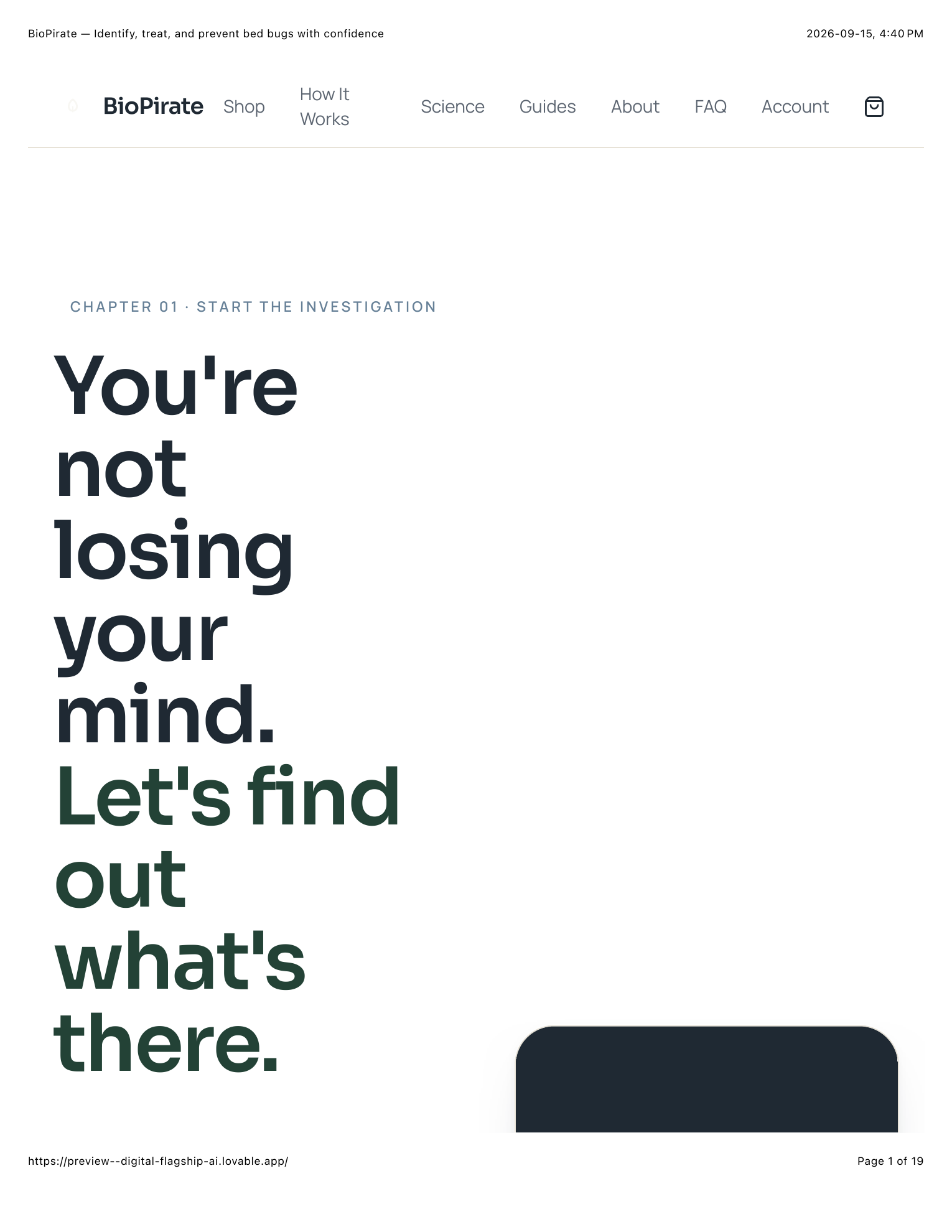
A customer concerned about bed bugs rarely begins with a clear purchase decision. They may have marks on their skin, noticed spots on their sheets, recently travelled, seen an insect, or simply be unsure whether they have a problem at all. A conventional ecommerce experience would immediately present products. BioPirate instead begins by helping the visitor investigate.
The product comes after the problem is understood.
The opening experience asks visitors what they have noticed so far. Rather than immediately adding products to a cart, the interface helps users identify the type of evidence they have and points them toward the appropriate educational next step. This changes the role of the storefront. It becomes part store, part guide, and part decision-support system.
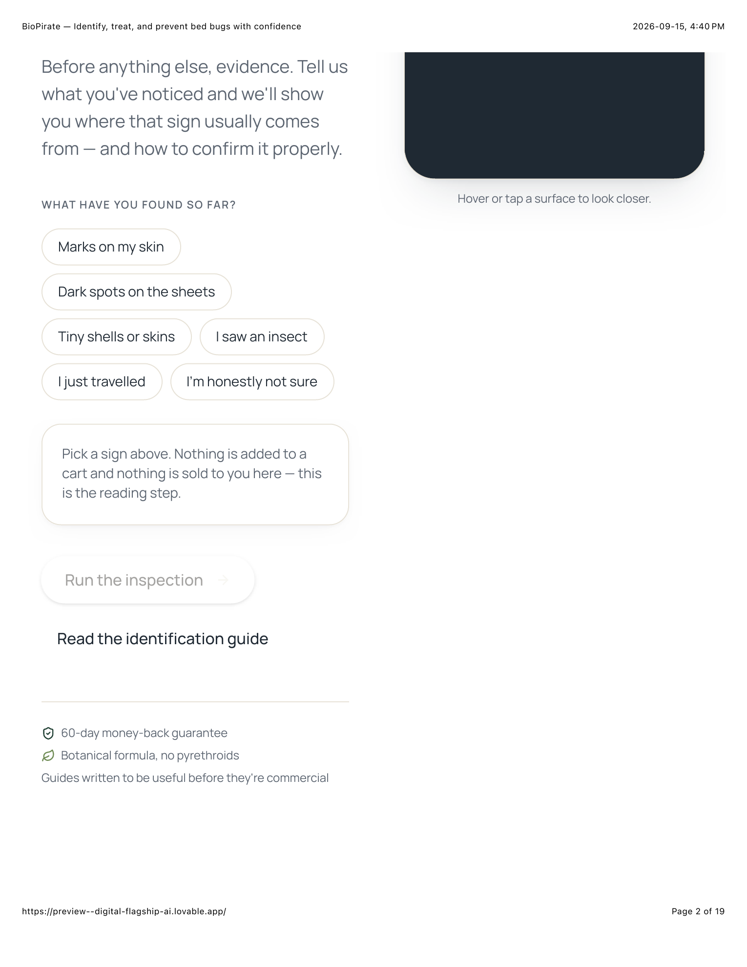
Educate before you sell.
For a product tied to uncertainty and anxiety, useful guidance can be more persuasive than an immediate sales pitch.
Start with the customer's situation rather than the catalog.
Give users a clear next action based on what they know.
Reduce pressure while helping the customer make progress.
The inspection experience transforms educational content into an interactive workflow. Instead of presenting a long article explaining where bed bugs may hide, the interface breaks inspection into specific zones and gives users a repeatable process for checking each one. This makes the educational layer part of the product experience itself.
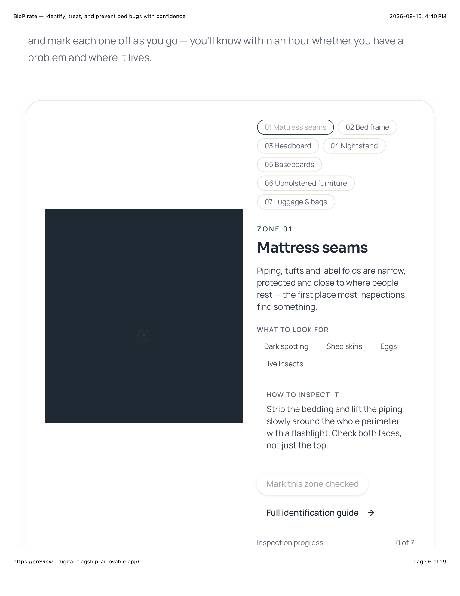
Content doesn't have to sit beside the product.
It can become part of the experience.
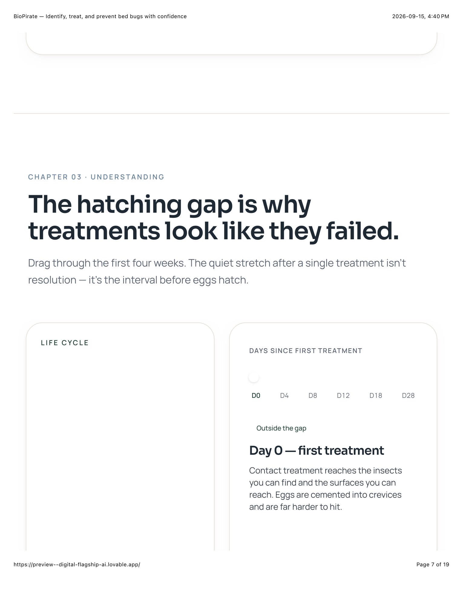
A major part of the experience is dedicated to helping customers understand the underlying treatment problem. Rather than relying only on product claims, the content explains concepts such as the treatment timeline, egg survival, the hatching gap, and why a single treatment may appear successful before signs return. That educational context gives the later product recommendation a reason to exist.
Understand the problem
↓
Understand the process
↓
Understand the product
Education reduces the gap between “Why would I need this?” and “I understand what I need to do.”
Instead of forcing shoppers to translate bottle counts into treatment requirements themselves, the experience asks questions about their actual situation. How much space is involved? Where are they in the problem? Those answers create a clearer path toward an appropriate treatment plan.
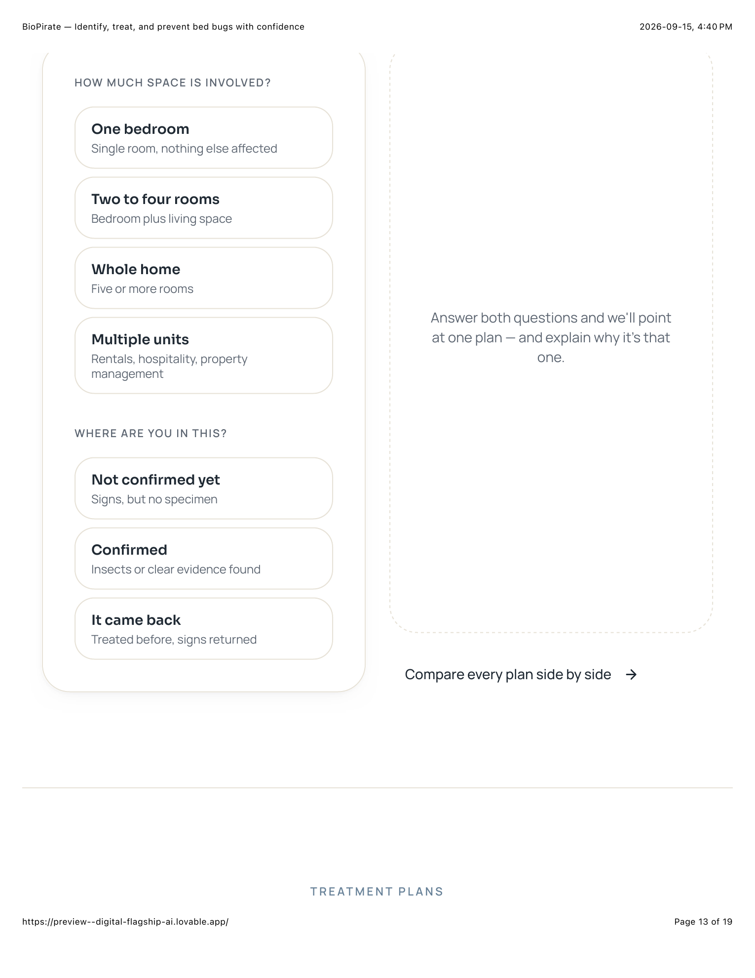
Customer situation
↓
Guided questions
↓
Recommended plan
↓
Product
Remove the calculation. Make the decision easier.
The product architecture reframes conventional quantity tiers as treatment scenarios. Instead of asking customers whether they want two, four, or eight bottles, the storefront presents options around the situation they are trying to solve. Starter Kit serves early-stage or single-room situations. Complete Home Treatment supports broader household treatment. Whole Home Protection addresses larger or recurring cases. Professional Supply serves landlords, hospitality, and property management.
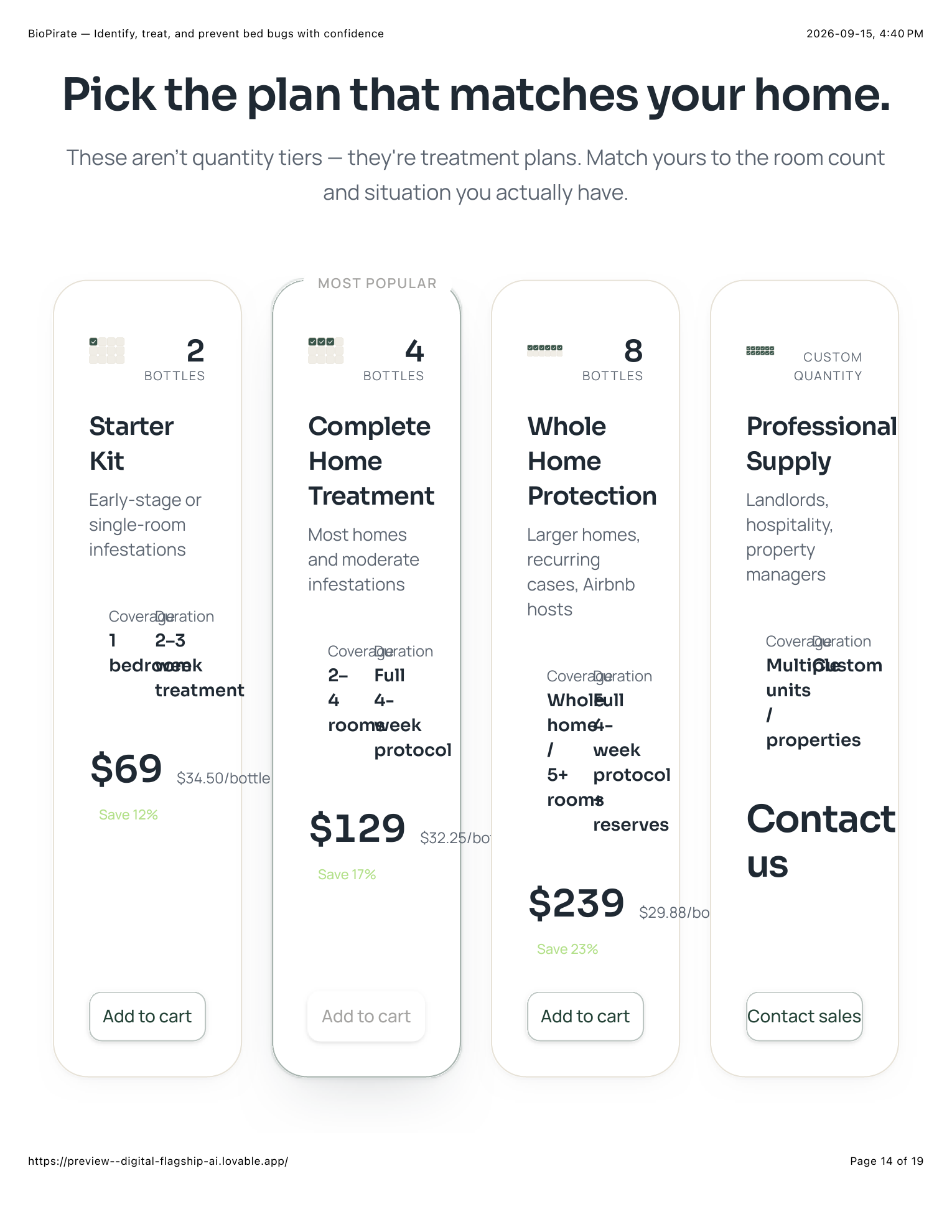
Merchandise around the job to be done.
The customer should be choosing the solution that matches their situation — not reverse-engineering quantities from a product catalog.
The storefront is designed as a decision journey rather than a sequence of disconnected ecommerce pages.
What have you found?
ThenHelp the customer verify the problem.
ThenExplain the biology and treatment process.
ThenDetermine the customer's situation.
ThenPoint toward the appropriate treatment plan.
ThenGive the customer a clear next action.
Identify → Educate → Recommend → Convert
The final purchase prompt comes after the customer has been given a framework for identifying the problem, inspecting their environment, understanding the treatment process, and choosing an appropriate plan. The CTA therefore does not need to manufacture urgency from nothing. It follows the logic established throughout the experience.
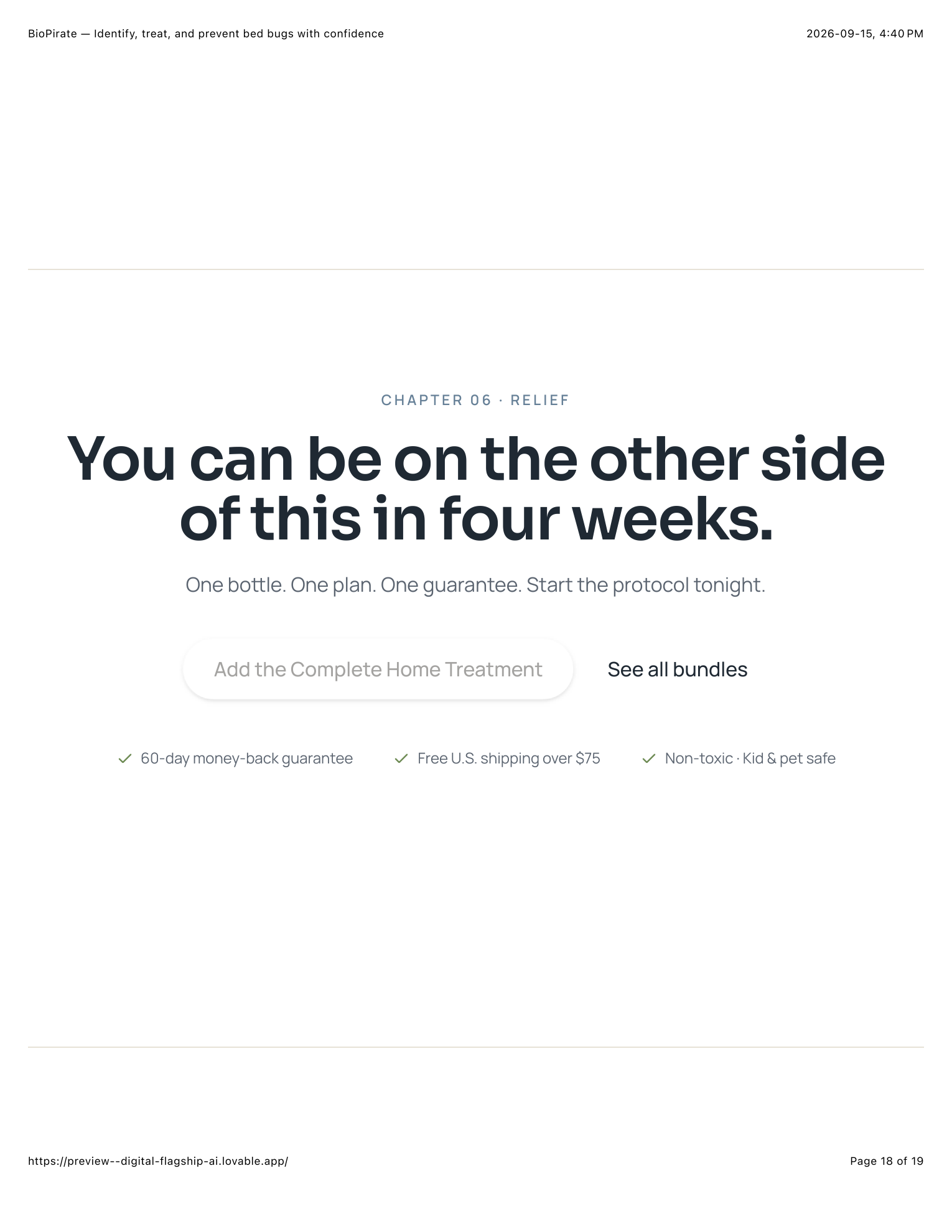
The best CTA is often the next logical step.
Designing the buying journey around customer intent rather than product inventory.
Moving users from uncertainty toward a clear next action.
Using customer inputs to reduce product-selection friction.
Explaining the problem and process before asking for the purchase.
Packaging products around situations, outcomes, and use cases.
Connecting education, interaction, product selection, and checkout into one coherent experience.
Don't just build a store.
Build the path to the purchase.
BioPirate demonstrates how ecommerce strategy, educational content, UX copy, interactive guidance, and product merchandising can work together as one conversion system.